Five Minutes
Mapping my five minute radius

Where
New Design University
St. Pölten
What
Data Visualisation
When
2018
In my 4th semester at New Design University we had a course called “Data Visualisation”.
The task was to explore the five minute radius of our home and choose three things which we then turned into three maps.
One map had to be analog, one digital and for one we could choose the medium.
My five minute radius stretches across four different districts and all of them are unique when it comes to how the land is used.
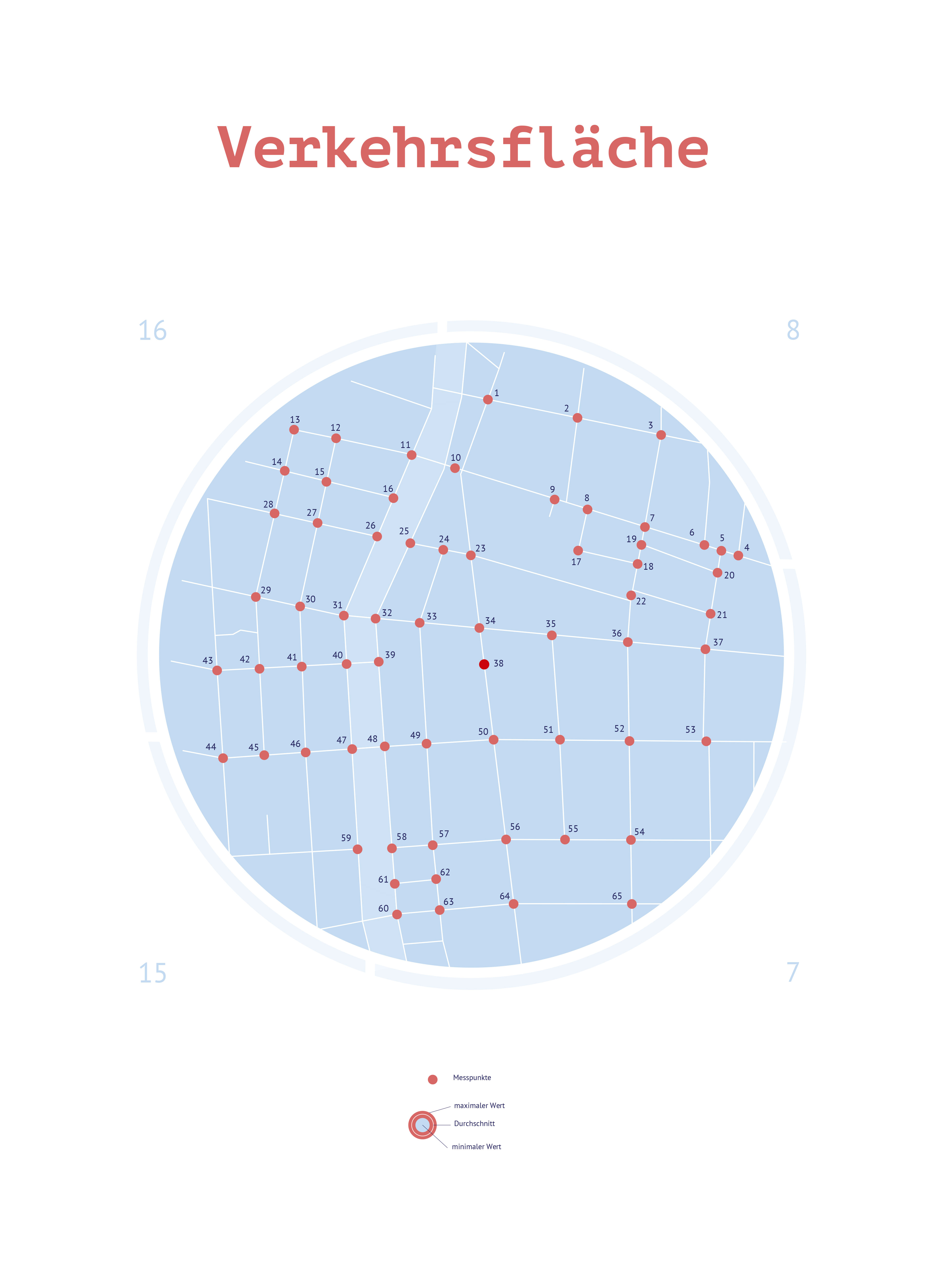
Therefore I decided to dedicate my project to the land usage of the districts, taking a closer look at green areas, traffic areas and building areas.
The final result included four maps and a brochure.
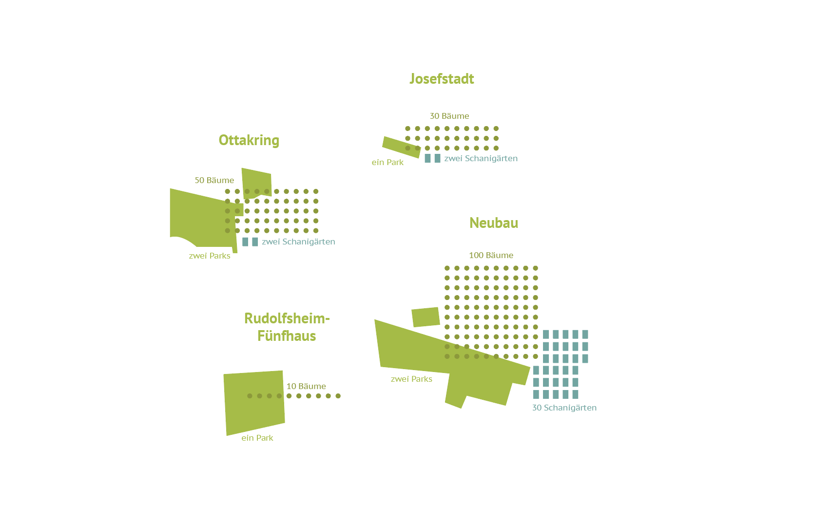
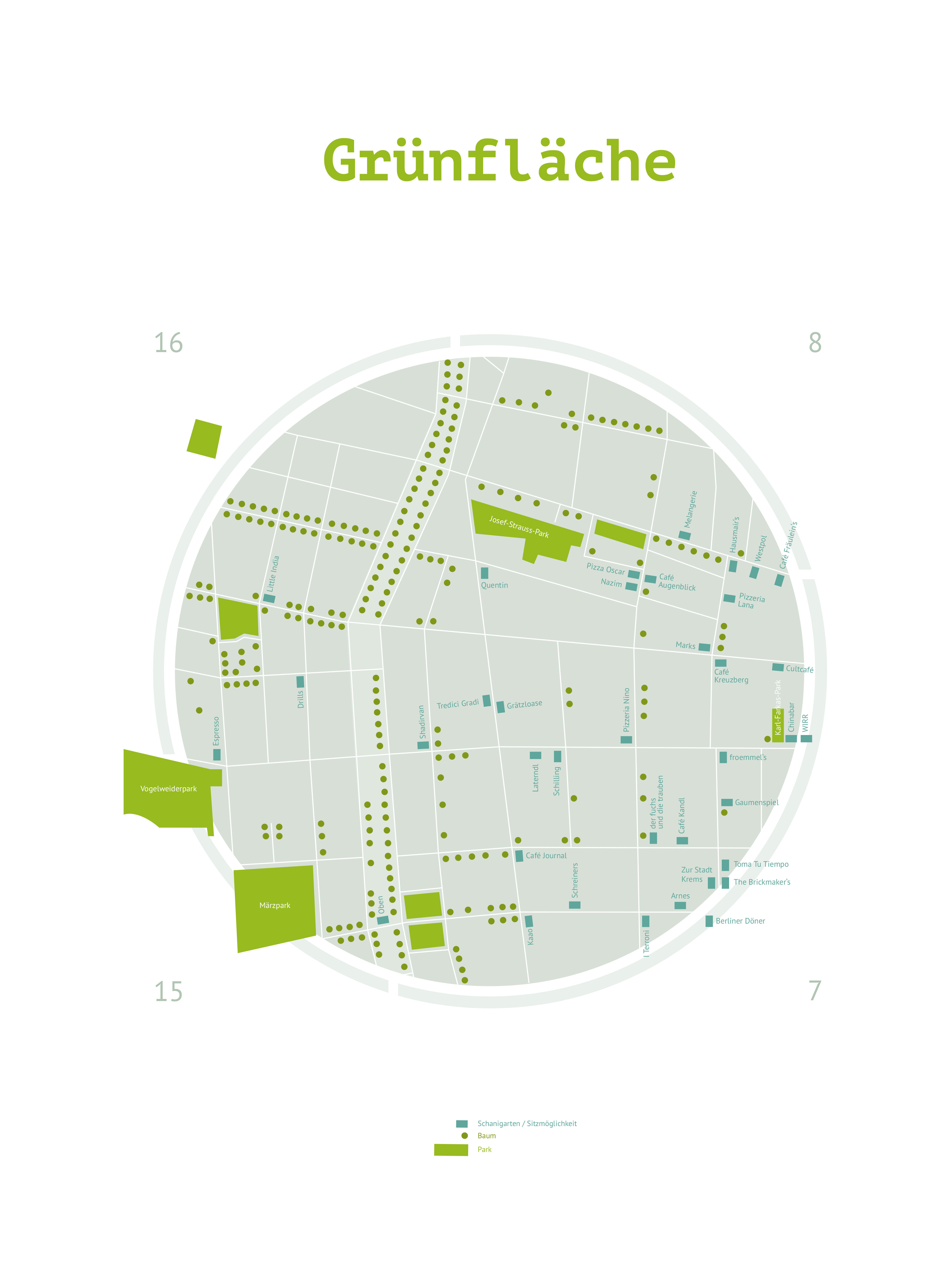
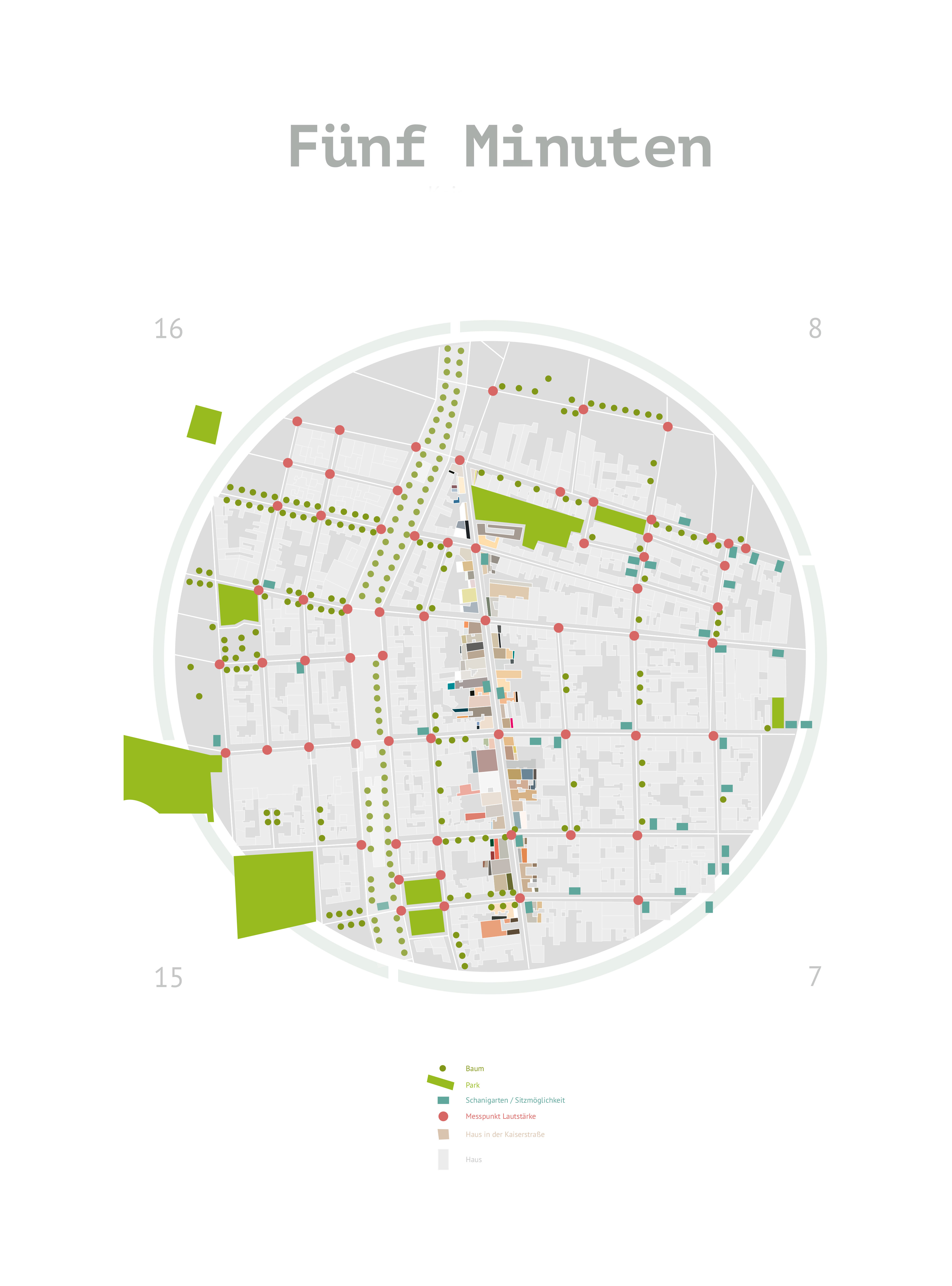
For the green area I collected information about parks, trees and the famous Viennese “Schanigärten” (small terraces on the street), combining natural and man-made green areas.
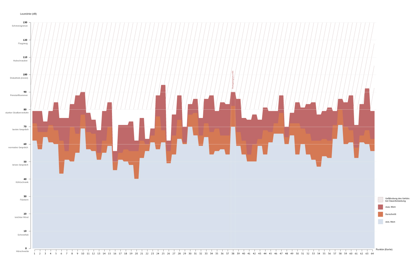
I collected one minute long sound-files of every junction for my digital second map. Using p5.js I connected the map with the sound files, providing the viewer with the sound and information of every junction when hovering over it.
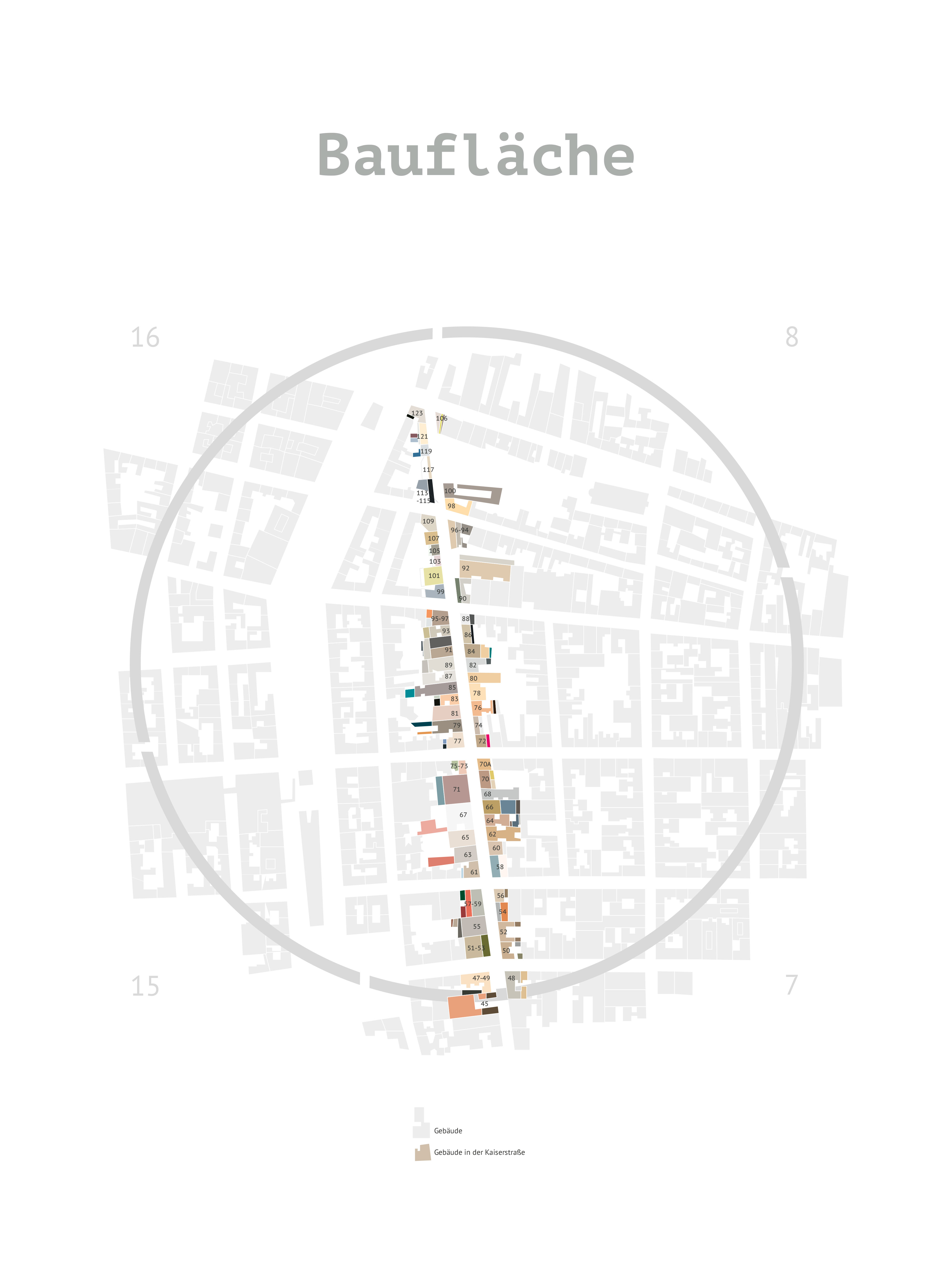
Wanna see it live?There are many aspects when it comes to buildings; I decided to map what you see first when you look at a building – the colour. For this map I took photos of all the buildings and estimated which colour takes up how much space.
Even though it was only necessary to create three maps, I made a fourth map by combining all the different aspects from each map. Neither the green area nor the traffic area or the building area alone make an environment into what it is. Only if you combine everything and put it together you can truly portray a place.